Tiny Budgets, Big Reveals

Start Smart: Budget, Scope, and Impact
01
The $5,000 Breakdown That Actually Works
Allocate roughly 15–20% for paint and prep, 10–15% for lighting, 10–20% for hardware and fixtures, 20–30% for storage solutions, and a contingency around 10–15%. This split steers resources toward big surfaces and daily-use touchpoints. Real case studies show this balance delivering the most dramatic results, controlling scope creep, and leaving wiggle room for inevitable surprises like damaged walls or mismeasured blinds.
02
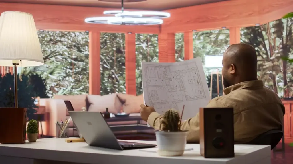
Define the After: Feel, Function, and Photos
Write a three-line brief describing how you want the space to feel, what must work better, and which photo angles should immediately reveal the improvement. These statements keep decisions aligned under pressure. When uncertainty hits, revisit the brief, ask if the purchase moves you toward that feeling, and confidently drop anything that does not clearly advance comfort, clarity, and daily ease.
03
Impact per Dollar: The Rule of Big Surfaces
Prioritize elements that control the largest visual footprint: wall color, flooring perception, curtains, lighting temperature, and storage lines. Dollar for dollar, these deliver outsized returns in after-photos and in daily life. Accessories are tempting, yet delaying them until foundations are strong preserves focus. The before-and-after difference becomes unmistakable when surfaces read calm, bright, and cohesive from the very first glance.
Living Area Revival: From Heavy to Airy
Light and Color Shift in One Weekend
Furniture Footprint: Float, Lift, and Reveal Legs
Textiles, Art, and a Focal Layer
Kitchen Refresh That Feels Custom
Hardware and Alignment: Tiny Pieces, Huge Perception
Matching pulls and knobs in a consistent finish calms visual noise and instantly modernizes older doors. A case study replaced twenty-three mismatched handles, corrected crooked attachments, and filled old holes before drilling new ones. For under $250, the cabinetry read as unified and intentional. Daily touchpoints improved noticeably, with smoother motion and fewer snags, reminding everyone that precision feels like luxury.
Backsplash Magic with Peel-and-Stick
High-quality peel-and-stick tiles, installed atop a meticulously cleaned surface, can transform the cooking zone in hours. One renter chose a matte, slightly variegated subway pattern to mask tiny alignment errors, then finished edges with inexpensive trim. The after result photographs cleanly, wipes down easily, and looks far more expensive than it is. Careful cuts and patient spacing made all the difference.
Lighting Layers and Work Rhythm
Clip-on under-cabinet lights and a warm, bright ceiling fixture altered shadows on the counter, making prep safer and faster. After adjusting color temperature and positioning, the cookline gained even luminance at eye level. Tasks that once felt dreary now flow, and photos show gleaming surfaces rather than dim corners. All in, the lighting layer stayed under $180 and radically uplifted daily routines.
Bathroom Glow-Up Without Demolition

Vanity Rescue: Paint, Hardware, and Mirror Scale
Grout, Caulk, and the Power of Crisp Lines
Storage That Breathes, Air That Moves
Bedroom Calm on a Tight Budget

Color, Acoustics, and the First Breath at Night
Curtains, Light Control, and Circadian Cues
Closet, Underbed, and the Path to the Pillow

Talk to the Landlord Like a Partner
Frame proposals around durability, safety, and marketability. Provide a short scope, finishes list, and photos of similar results. Emphasize reversibility where relevant. Many owners greenlight lighting and hardware when presented with clear benefits. In our experiences, respectful transparency yielded partial reimbursements, protected deposits, and opened doors to modest paint updates that would have otherwise been denied or delayed indefinitely.
Where to Splurge, Where to Save for Resale
Spend on items that endure daily touch: faucets, hinges, drawer slides, and quality fabrics. Save on decorative layers you might swap seasonally. This approach keeps the apartment functional now and transferable later. When moving out, you can relocate portable pieces, restore surfaces easily, and enjoy the satisfaction of value created without sacrificing flexibility or your financial breathing room.
Document the Reveal and Inspire Others
Take consistent angles, same-time-of-day photos, and quick cost notes. Your before-and-after sequence becomes its own roadmap for friends and readers. Share sources, pitfalls, and unglamorous fixes that mattered most. Engage in comments, trade tips, and subscribe for future breakdowns. Collective learning shrinks mistakes and multiplies confidence, letting more people experience beautiful, livable change under realistic budget constraints.

All Rights Reserved.